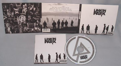
Below is the Digipak for the album 'Minutes to Midnight' by 'Linkin Park', a band which is similar to 'Bloc Party's genre of music in the sense that they both use heavy strings and industrial sounds in their music. As you can see, this digipak shows light and dark tones, similar to 'Bloc Party's album digipak 'Silent Alarm'.
'Bloc Party' and 'Linkin Park' are both well known and highly popular bands, both using the similar conceptual style of photography on their digipaks. From this research I have found that maybe the black and white tones, mixed with conceptual photography is the style of image a consumer would expect to see on the digipak of an Indie/Rock/Rave band, such as 'Bloc Party'.
Here is the next digipak I am now going to analyse. This is 'The Killers' 'Greatest Hits' album. Again, the digipak is completely in black and white, apart from the album name in a red font, and uses photography as its front cover, even though it doesn't appear as conceptual as 'Bloc Party' or 'Linkin Park's covers. This constistant style for albums either sounding like, or aiming at the same target consumers as 'Bloc Party' gives the impression that this is what the producers associate with the Industrial/Indie/Rock/Rave market; meaning that perhaps the consumers of that particular market will identify another similar style digipak as the genre of music which they listen to; hense informing them that this is the product for them.


No comments:
Post a Comment